Psychological and Psychiatric Terms to Avoid

6gM7XbY(26) Steep learning curve. Scores of authors use the phrase “steep learning curve” or “sharp learning curve” in reference to a skill that is difficult to master. For example, when referring to the difficulty of learning a complex surgical procedure (endoscopic pituitary surgery), one author team contended that it “requires a steep learning curve” (Koc et al., 2006, p. 299). Nevertheless, from the standpoint of learning theory, these and other authors have it backward, because a steep learning curve, i.e., a curve with a large positive slope, is associated with a skill that is acquired easily and rapidly (Hopper et al., 2007).

Frontiers in Psychology: Fifty psychological and psychiatric terms to avoid: a list of inaccurate, misleading, misused, ambiguous, and logically confused words and phrases

Barbie and Gender Bias Language in Tech

barbie3Mattel recently faced a barrage of criticism after a blogger excoriated them for the story and language of the book Barbie: I Can Be A Computer Engineer. The book, in Barbie’s “I Can Be…” series and published in 2010, has now been discontinued. But it continues to provide an interesting look at how, while some comments and word choices may seem benign individually, when combined to represent the language of a culture, it can be seen more clearly as a subtle yet endemic problem.

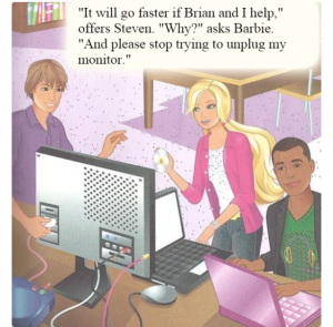
Putting aside the narrative—Barbie essentially breaks her sister Skipper’s computer, then has some male friends fix it while she enjoys the credit—it is disappointing that the language used was not more carefully vetted by Mattel. Blogger and IT professional Karen Lopez provided an excellent “refactoring” of the text of the book:

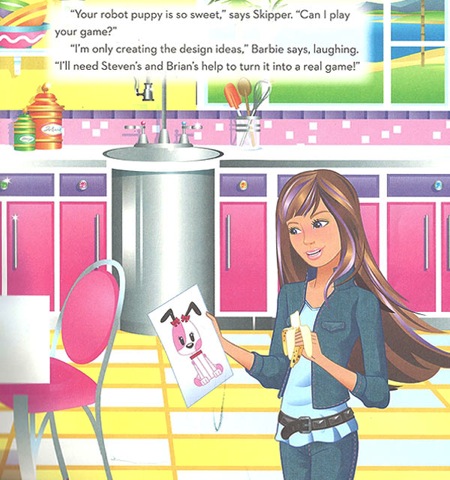
In the page shown above, when Skipper asks if she can play the video game Barbie is working on, Barbie says:

“I’m only creating the design ideas,” Barbie says, laughing. “I’ll need Steven’s and Brian’s help to turn it into a real game.”

This not only demeans the designer’s vital role in game creation, but makes Barbie sound less than competent. Lopez rewrites the line:

“Not yet,” explains Barbie. “I need to finish the design, then work with Steven and Brian to turn it into a game.”

The meaning of both versions is largely the same, but the belittling terms “only,” “need” and “help” have been removed or replaced. And rather than “laughing” at Skipper’s assumption that her game might actually be functional, she instead “explains” that design is one part of many in the process of game creation.

If you’ve read through the original Barbie: I Can Be A Computer Engineer, whether on Pamela Ribon’s site or elsewhere, Casey Fiesler‘s “remix” of the book (reposted here on Slate) is a refreshing follow-up read. (Computing PhD candidate Fiesler is on the legal committee for the Organization for Transformative Works, making her remix of particular interest in regard to modern issues of copyright law. To quote from her blog, “One of my favorite things about remix: If you don’t like the narrative, change it!”)

Barbie has issued an apology on Facebook, the book’s author has commented on the controversy, and Mattel has removed the book from online distribution venues. Regardless, the internet has continued to have fun creating alternate versions of it. You can even make your own!

revised Barbie pageWhile Barbie has been no stranger to feminist debate over her long life (remember “math is hard“?) many people have been surprised at the quality and entertainment value of some other recent Barbie-related media, such as the 2009 DVD Musketeer in Pink (Barbie is D’Artagnan!) and the not-awful short video seriesBarbie Life in the Dreamhouse,” now in its fifth season.


Twitter and the Heartbreak of PowerPoint

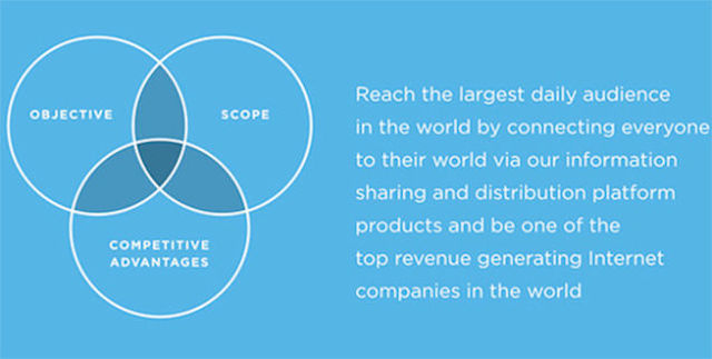
mission statement slideIt’s hard to even know where to start. This PowerPoint slide “explaining” Twitter’s new strategy statement is amazingly incoherent. What does the Venn diagram mean? What is the difference between the company’s scope and their competitive advantages? And what could “objective” possibly mean here? How is “be[ing] one of the top revenue generating  companies in the world” a strategy? Could they fit the word “world” in one more time? Dennis K. Berman of the Wall Street Journal points out via Twitter itself that the slide includes “35 words, 62 syllables, 4 clauses, [and] 2 grammatical errors.” (He also retweeted a sentence diagram of it.)

But others have written more detailed reviews of this remarkable sentence. The Washington Post, The Harvard Business Review, and Valleywag have all covered it.

Lulu Books Update & Review

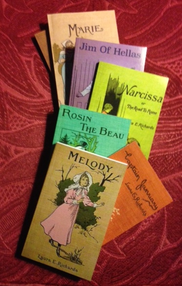
littlebooks A few of the wee Victorian novels have arrived, so here’s an update.

COVERS: The covers came out great. The color reproduction is good, and the cover stock is of similar quality to that of Lulu’s premium paperbacks. It feels as if they may not be quite as slick, but that only makes them a bit less shiny. As mentioned before, the only style choice for these little books is glossy. The trim margin is a larger percentage of the entire cover for books this size, so adjusting for variations in cropping requires a bit more attention, and variations in individual print runs are more noticeable, but they’re generally pretty centered and even. It’s very useful to have the cover dimensions available in the earliest steps of the creation wizard so I can work on finishing them up while the body text uploads.

STOCK: The paper stock is of good quality. My previous paperbacks were done on cream-colored 60# paper, which is really nice—as good as Lulu gets. These books are only available in 50# white, but it is still very good paper—much nicer than “pulp” paperback
Melody Illo

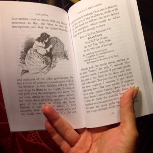
Reverse-side print is visible, but not bad. Images printed nicely. Click image for a closer look.

stock. You can definitely see the reverse-side print through the paper, but not so much as to make reading difficult.

PRINT: Other than a bit of bar code visible near the spine on one last page (you’d have to look for it to notice), the printing seems good. The ink is, as with all the Lulu books we’ve done, crisp and does not smudge. The illustrations also printed true to the originals.

SHIPPING: Shipping cost is the biggest expense in the making of these books on my end, so I try to order them in batches, and I take advantage of free shipping coupon codes whenever possible. Books ordered on October 6 were shipped on the 10th (printing of these books takes from 3–5 days) and delivered on the 15th. The least expensive shipping method uses a combination of UPS and USPS—UPS delivers to my post office, then USPS takes it from there.

PACKAGING: Lulu packs their books somewhat strangely, but securely. Although these books are tiny, they come in the same large shipping boxes as bigger books. The box is strapped with plastic bands, and inside, the books are shrink-wrapped onto a large piece of cardboard. (I’ll take pictures next time I get a new batch.)

ORDERING: I’ll need to collect more reports from others on the ordering process, but one problem seems to be that if you are not yet a Lulu customer and you click on one of my links to a book and add it to your cart, at checkout you are prompted to create an account.
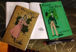
Pen for scale.

Pen for scale.

But when the account creation process is complete, items previously added to your cart are no longer there. It’s true Lulu’s shopping cart is not perfect, and with print-on-demand books it is pretty much impossible to make changes of any kind after ordering.

MARKETING: Although most of the marketing tools available for premium books are still there, I don’t see a way to have an ISBN automatically added to the tiny books (you can always buy and add your own).  This is particularly important to know for designing a one-page cover, as the templates still have blacked-out sections where space is meant to be left for the bar code. (There’s no bar code.) Also, it looks as if the page preview function doesn’t work on the book’s sale pages, but this issue may be a bug rather than a choice on Lulu’s part. There doesn’t seem to be any information about the issue on the site.

Now I just need to figure out what to do with these little books next. Any ideas?

Quick Link: Why Academics’ Writing Stinks

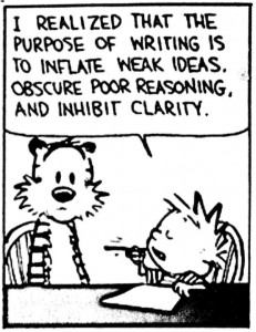
academicwritingBad writing is a deliberate choice. Scholars in the softer fields spout obscure verbiage to hide the fact that they have nothing to say. They dress up the trivial and obvious with the trappings of scientific sophistication, hoping to bamboozle their audiences with highfalutin gobbledygook.

Steven Pinker: Why Academics’ Writing Stinks
The Chronicle ReviewThe Chronicle of Higher Education

The New Lulu & my Laura E. Richards Editions

I tried out the recent changes at Lulu by publishing a series of books by Laura E. Richards marie_thumbnailfrom the 1890s. The new publication process has a few changes, both good and not-so-good:

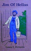
Now you can choose all aspects of your book format on the first page, and easily see which formats are acceptable for retail distribution by a green check symbol. You can also get information on available volume discounts, and the cover  measurements, including the spine width for your number of pages (important for cover design). There are more photos of the available cover styles  and bindings, Jim of Hellastoo. They have a distinction between “standard” and “premium” paperback formats now—you’ll need to choose a premium format if you want retail distribution or cream-colored paper. There also seems to be less choice of paperback finish—the formats I’ve looked at so far are only available as glossy.Melody I also noted that for the new “standard” paperbacks, there do not seem to be any volume discounts available.

The Content Creation Wizard follows the book type selection page, and it is largely the same as it was before the recent (fall 2014) changes. As before, the Wizard defaults to sending you to the Cover Wizard for cover creation, but if you have some graphic design skills, you’ll want to choose the advanced one-piece cover designer.

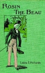
Rosin The BeauI made the Laura E. Richards books in the smallest available size: 4.25″ x 6.88″ paperback—Lulu calls it “pocketbook” size. They should be here soon, so I’ll post about how they came out and how they compare to my previous paperback publications when they get here.

Editing these little stories in the public domain, using a variety of sources, gave me the opportunity to spend more time learning the ins and outs of Nisus Writer Pro, which I like as a word processor quite a bit so far.  It was also interesting to look over the differences between online versions of the books, and the errors that propagate through various digital versions. (For example, every digital text version of Marie I looked at, including a free Kindle version, was missing an entire chapter.) I usually started with a .txt version of the body text, and compared it as I went along to scanned PDFs to make OCR corrections and to try to replicate some typesetting styles.

It’s been a fun project. I’ve enjoyed learning more about the work of a lesser-kown prolific and popular American author, and I’m already starting on another series.
Books by Laura E. Richards: New Pocket Paperback Editions

Q&A with a Technical Editor Redditor

Tibetan fox

The wise yet skeptical Tibetan fox. Via imgur.

The New Reddit Journal of Science recently featured an AMA (“Ask Me Anything” Q&A) with a science writer and technical editor. She offers some really helpful comments and links to people who want to work in science journalism.

Science AMA Series: I’m Celia Elliott, a science writer and technical editor, and today I’d like to answer your questions about improving your technical communications, AMA! : science. Bonus link, possibly also of use: a search for “editing” within the subreddit r/writing. Sometimes there are some interesting tidbits in there.

tidbit |ˈtidˌbit| (also chiefly Brit.titbit |ˈtit-| )
noun
a small piece of tasty food.
• a small and particularly interesting item of gossip or information.
ORIGIN mid 17th cent. (as tyd bit, tid-bit): from dialect tid ‘tender’ (of unknown origin) + bit.
New Oxford American Dictionary, 2nd Ed.